Creating Effective UX Copy for Handshake
For the final project of my UX Content Collective writing course, I took on the role of UX writer for a fictional app called Handshake. I was tasked with creating a consistent voice and tone style guide for the brand, and improving the UX copy within the app in Figma.
About the app: Handshake is a fictional payments app designed for freelancers and business owners. Business owners use the app to pay freelancers and track the progress of hours worked. Freelancers use the app to bill business owners and report progress on a paid project.
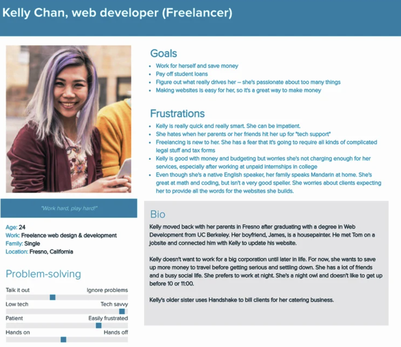
Research: I was given two user types for the app: Kelly Chan, a freelance web developer who fears complicated legal paperwork and tax forms, and Tom Stewart, a small business owner in his 60s who wants painless tech and admin support.
Using these two personas, I conducted research using Google Trends into the terms that would compose their shared language when working together:
Proposal, instead of plan
Hourly rate, instead of price
Payment, instead of transaction
Freelancer, instead of independent contractor
I explored the emotions both a business owner and freelancer might feel when considering the app:
The freelancer might feel…
Nervous when requesting payments or proposing budgets
Relieved and appreciative to receive a payment or budget approval
Proud to report their progress to the business owner
Excited to create new projects
Stressed when they need to track their time
The business owner might feel…
Reassured that they have an easy way to access payment requests and budget proposals.
Happy when seeing the freelancer’s progress on their projects
Both overwhelmed and satisfied when they need to send payments (depending on their funds)
Voice Guidelines: My research helped me create a consistent voice for the Handshake app with the characteristics below:
Approachable, not inexperienced: “Need help starting an invoice? Let’s do it together.”
Self-assured, not preachy: “Here’s a list of the invoices you’ve paid in 2022. We recommend saving them separately to a safe place.
Empowering, not patronizing: “Great job! Your budget has been sent for approval.”
To put those guidelines into use, the designer asked me to brainstorm some headline + body sentence pairs for the app’s onboarding tour screens:
Every second counts: Hassle-free time tracking for billable hours.
Painless payments: Send or receive quick, secure payments anytime.
Happy budgeting: Take on project budgets with full transparency.
See where you stand: Track the progress of a project from anywhere.
Keep growing: Make new projects happen in just a few taps.
Ready to connect? Invite whoever you’re working with to the app.
UX Copy Overhaul: I used my findings and style guide to edit the UX copy within the app for the upcoming design review.
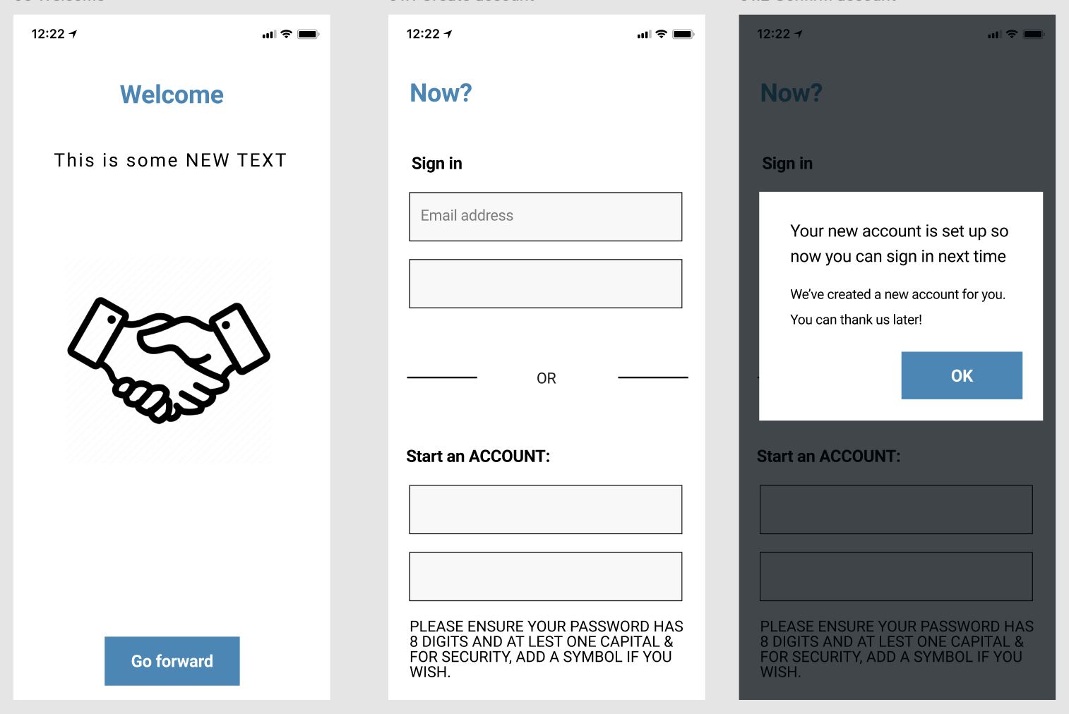
Welcome Screens - Before
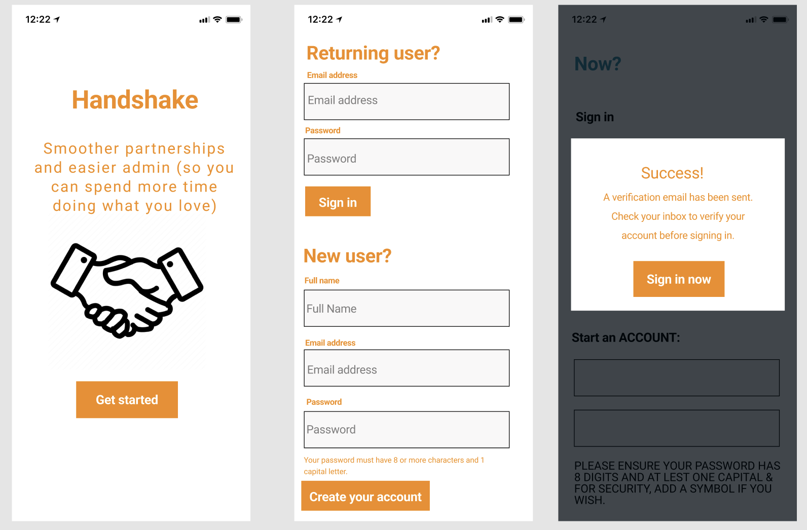
Welcome Screens - After
My edits:
Added an engaging slogan that appeals to both freelancers and business owners
Created clear, specific CTAs that make the user feel confident in the next step of their journey
Provided concise hint text so the user knows exactly what to input in fields
Avoided a design flaw by splitting up the sign in and create account steps for returning and new users
Let the user know what would happen after creating a new account
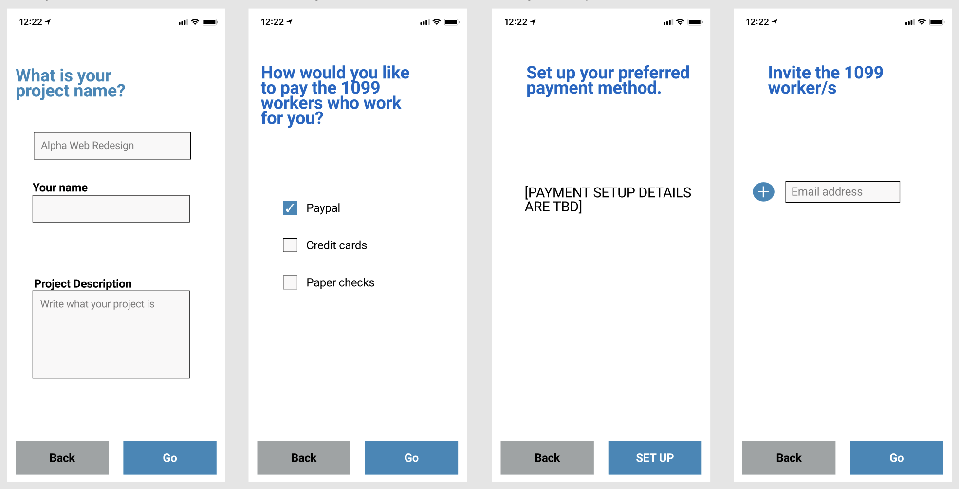
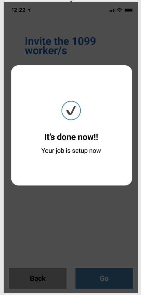
Business Owner Setup - Before
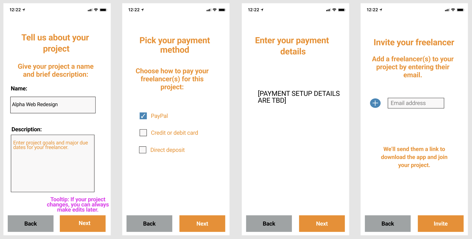
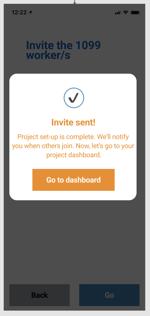
Business Owner Setup - After
My Edits:
Improved headers to be more straightforward and conversational
Provided more guidance to the business owner on what should be entered in the description field
Fixed grammar and spelling mistakes (i.e. Paypal —> PayPal)
Let the business owner know exactly what would happen once they invite their freelancer to the app
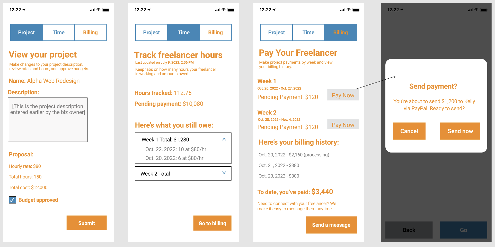
Business Owner Ongoing Use - Before
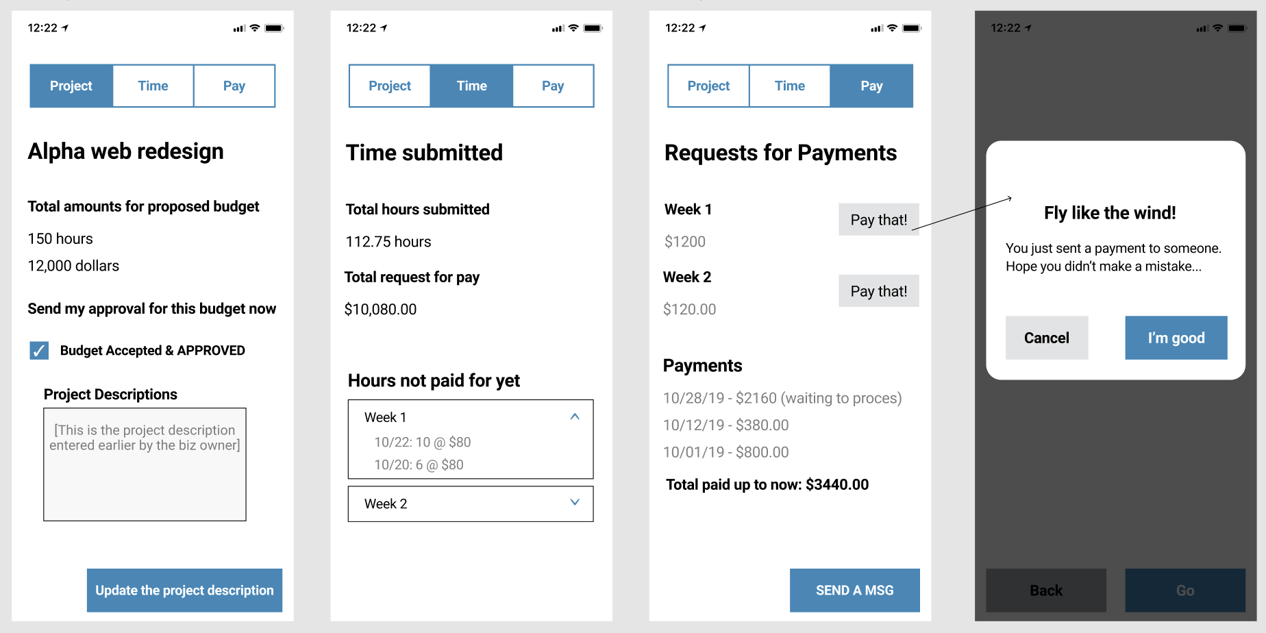
Business Owner Ongoing Use - After
My Edits:
Aligned currency and date formats to be consistent throughout all screens
Adjusted microcopy to cut down on unnecessary words (i.e. waiting to process —> processing)
Changed the last screen to confirm payment before it’s sent, adding dynamic text that lets the business owner know exactly what they’re sending and to whom
Other considerations I had for the Designer and/or Product Manager:
On the sign up screen, consider making the returning user versus new user two different screens for more space.
It’s not super clear what screen a returning user is going to after they log in. Is it the project dashboard?
What if the payment preference doesn’t match between the business owner and the freelancer? Can we send them a notification or message if that’s the case?
Can we add a subject field and body field for the message screens to help users find and differentiate between messages?
We should consider adding a button and subsequent screen for the business owner to negotiate the budget/hours with the freelancer.
Takeaways: It was an incredibly valuable learning experience to fulfill the role of UX writer on a product from start to finish. Conducting user research, refining voice and tone and learning about microcopy, hint text and tooltips helped me create compelling user-first content on every step of the journey. It allowed me to gain firsthand familiarity and confidence with Figma, understand how to work cross-functionally with product managers and designers and consider user testing in the future as an imagined last step.
